Brand Glow Up for The Rojas Team
Project Goals:
Build a multicultural brand foundation rooted in values and mission.
Develop a brand story and core messaging that reflects who they are.
Create a cohesive visual identity that honors their community and culture.
Client Overview
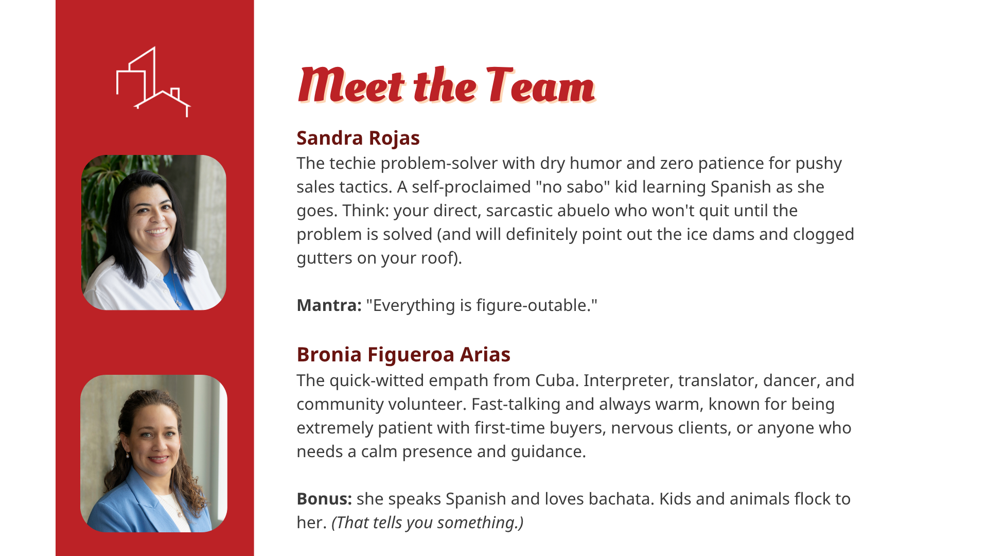
The Rojas Team is a bilingual realty company in Grand Rapids, Michigan, led by Latina entrepreneurs Sandra and Bronia. Their approach is personal, bilingual, and built for clients that traditional brokerages often overlook — particularly queer and Latino homebuyers who deserve an advocate who truly understands their experience.
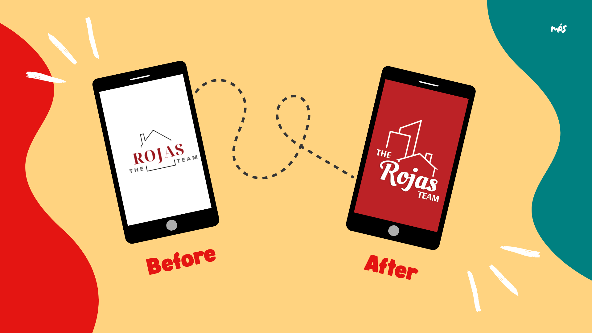
They came to us with an existing logo they weren't fully satisfied with and, more critically, no brand story or core messaging to support it. There was no language that captured what made them different — their deep community ties, their cultural fluency, their genuine investment in the people they serve. The visual identity had no foundation beneath it.
The Rojas Team had the relationships, the reputation, and the results. What they needed was a brand that could finally say, out loud, who they are and why it matters. This project centered on building that foundation first — a multicultural brand kit grounded in their values, mission, and unique approach — so that every future touchpoint, from social media to signage, could speak with consistency, confidence, and cultural resonance.
Along the way, this work also reflected the power of a trusted, culturally aligned creative ecosystem. Sandra hadn’t had updated headshots in years and was understandably nervous stepping back in front of the camera, so we connected her with a Latina photographer from our Colectiva, Isabel Media Studios, to create visuals that felt both comfortable and representative. For the visual identity, we partnered with Latina graphic designer Naomi Silas to shape a logo direction that felt intentional, elevated, and aligned with their brand foundation.
Deliverables
Brand story & core messaging
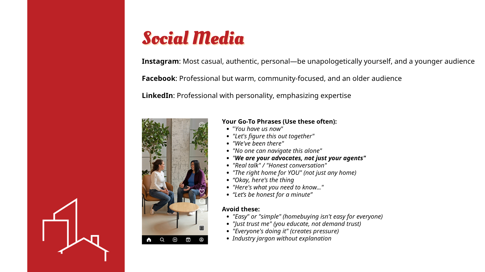
A foundational narrative articulating The Rojas Team's origin, values, and community-centered purpose — giving Sandra and Bronia language they can own and use across every channel and conversation. This included thoughtful integration of Spanglish and Spanish-informed phrasing to reflect how they naturally communicate with their community, while intentionally stopping short of full translation to honor Bronia’s expertise as a certified translator.
Multicultural brand kit
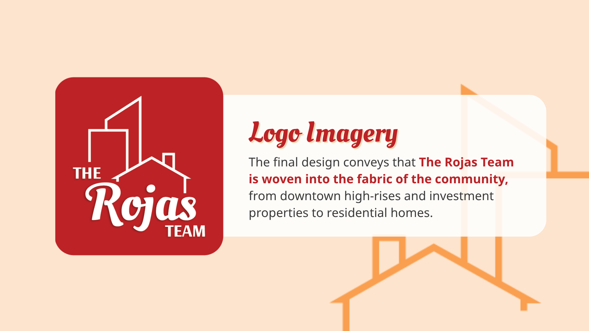
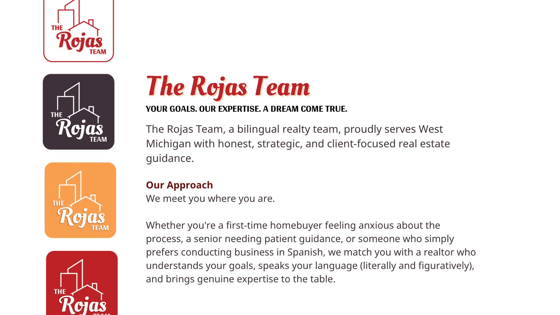
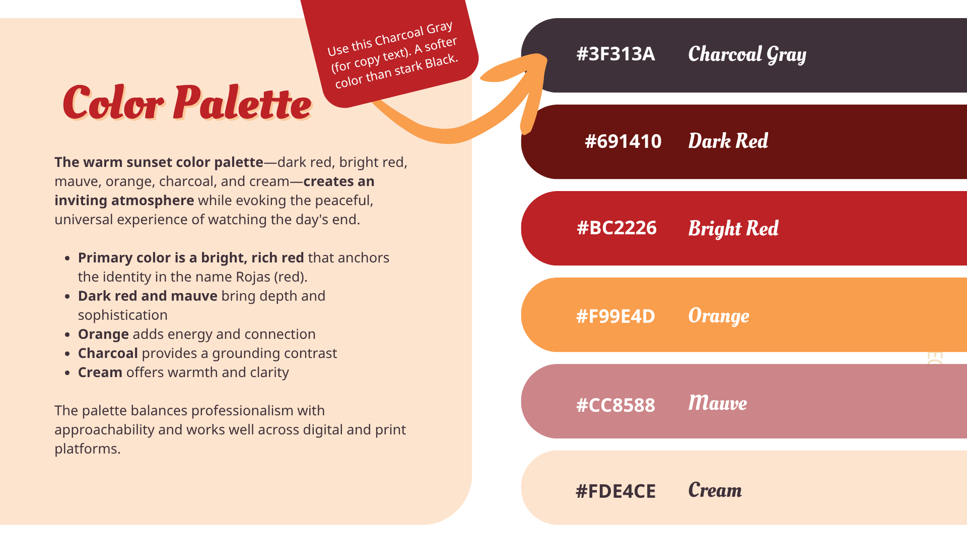
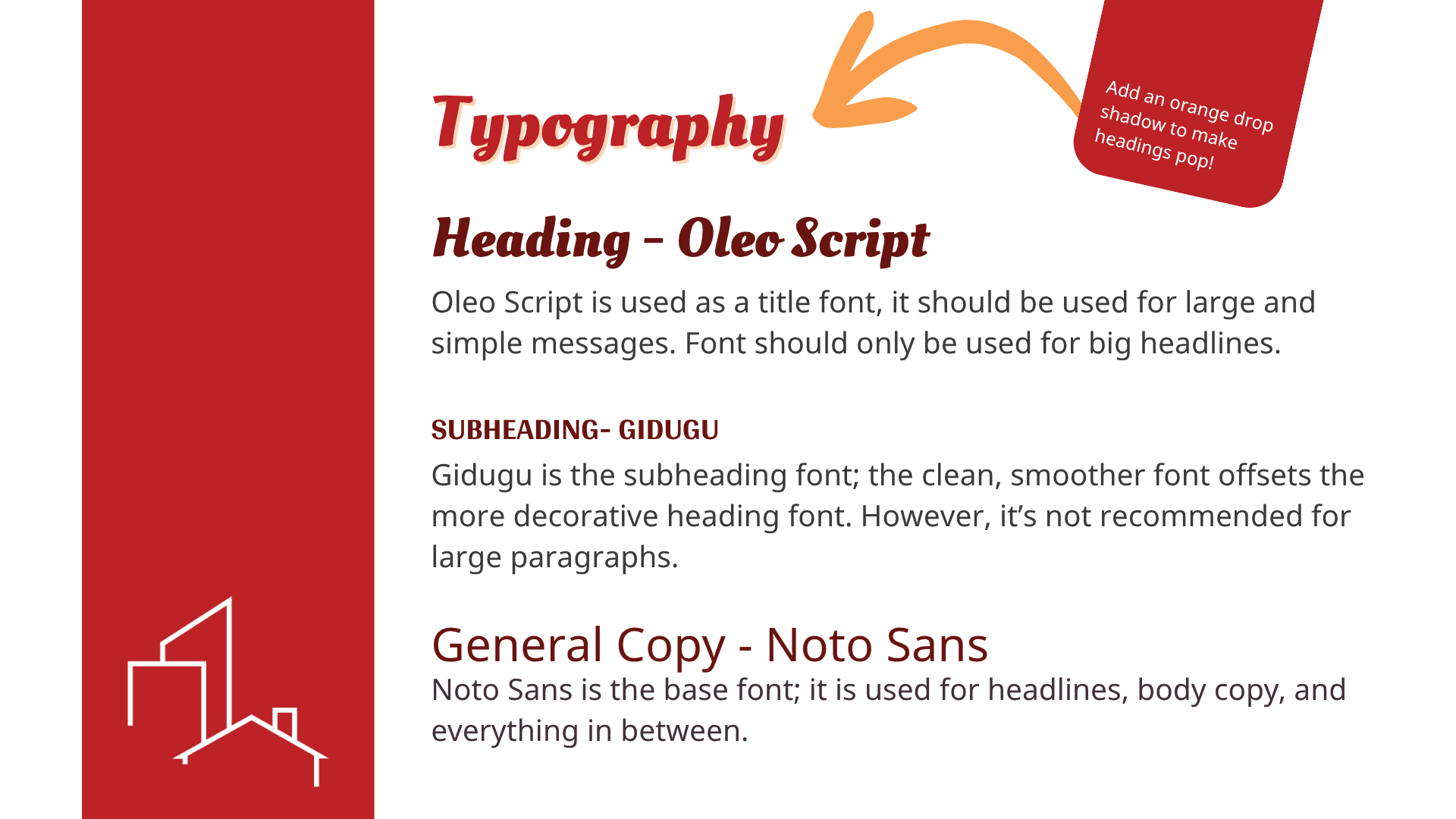
A cohesive visual identity system — including refined logo direction, color palette, typography, and cultural design elements — that reflects the richness of their queer and Latina heritage and speaks authentically to the communities they serve.
Multi-platform expansion strategy
Strategic recommendations for reaching target audiences beyond Meta — including niche platforms like HeyFamm, Everywhere is Queer, People First Economy, and Spanish-language media — with guidance on adapting brand voice and messaging for each context.