Designing for The Furthest Outlier: Consulting for Resilience Brand Build

Consulting for Resilience LLC
Project Goals:
Brand Identity Development: Create a distinctive logo, color palette, and typography that embodies Consulting for Resilience’s values of accessibility, equity-centered design, and multiculturalism.
Brand Messaging: Develop a foundational messaging toolkit, including a tagline, brand story, and tone-of-voice guidelines to support future marketing and outreach.
Website Design: Develop core messaging, design, and site structure for a new website that is bilingual (English/Spanish) and simple for non-developers to manage in the future.
Client Overview
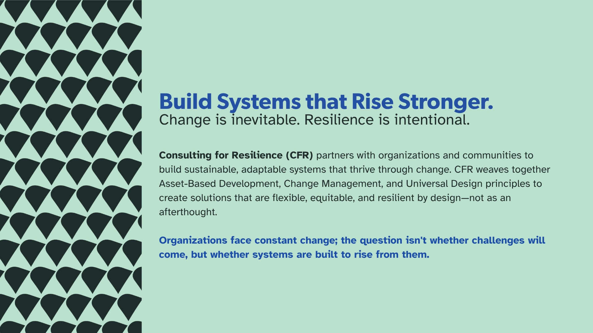
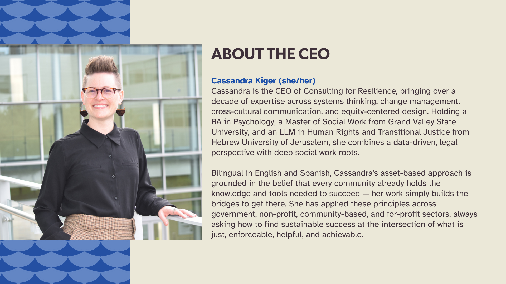
Consulting for Resilience partners with organizations and communities to build sustainable, adaptable systems by weaving together Systems Theory, Change Management, and Strategic Planning. Founded by Cassandra Kiger, whose vast experience spans Human Rights and Transitional Justice, Macro Social Work, and Public Education, the organization reflects her core belief that lasting change requires both structure and flexibility.
A problem-solver at heart, Cassandra brings a deep passion for inclusivity and a commitment to long-term, sustainable solutions to everything she does. When she came to Más Marketing for a logo and website, we knew her brand had to be more than aesthetic — it needed to be a visual expression of her principles.
Designing for the Furthest Outlier
Logo Mark
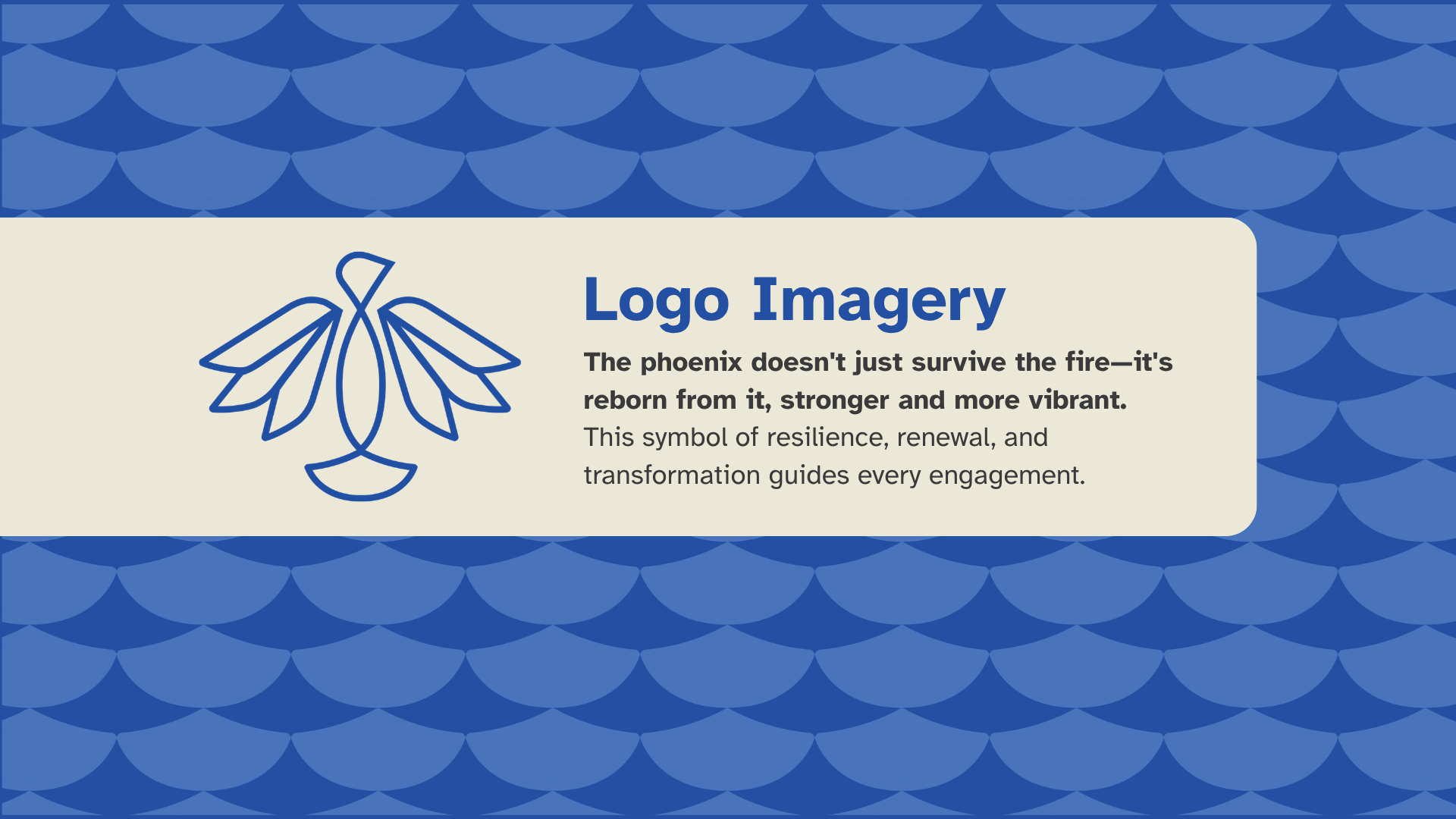
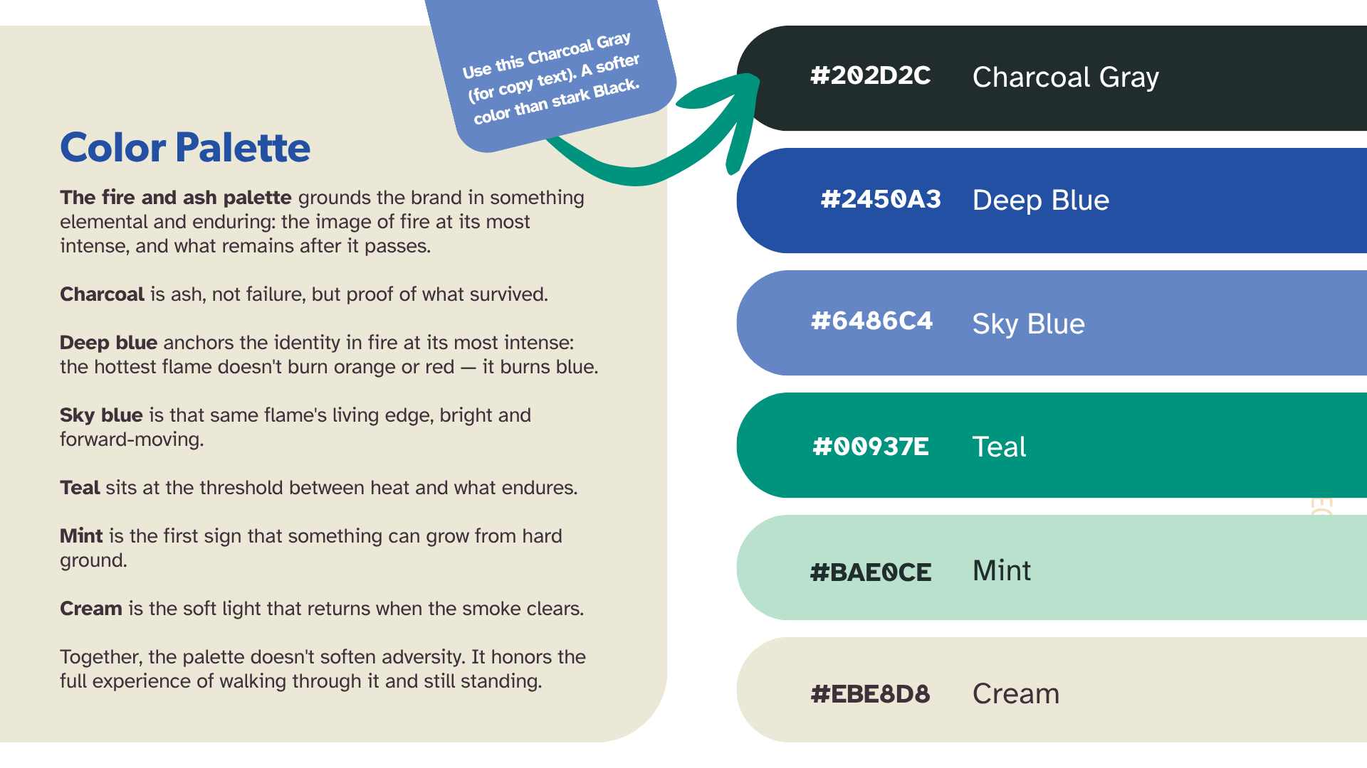
From our first conversations with Cassandra, her vision was clear: she wanted to incorporate the phoenix — a symbol of transformation and resilience — and a deep blue as the anchor color, representing fire at its hottest.
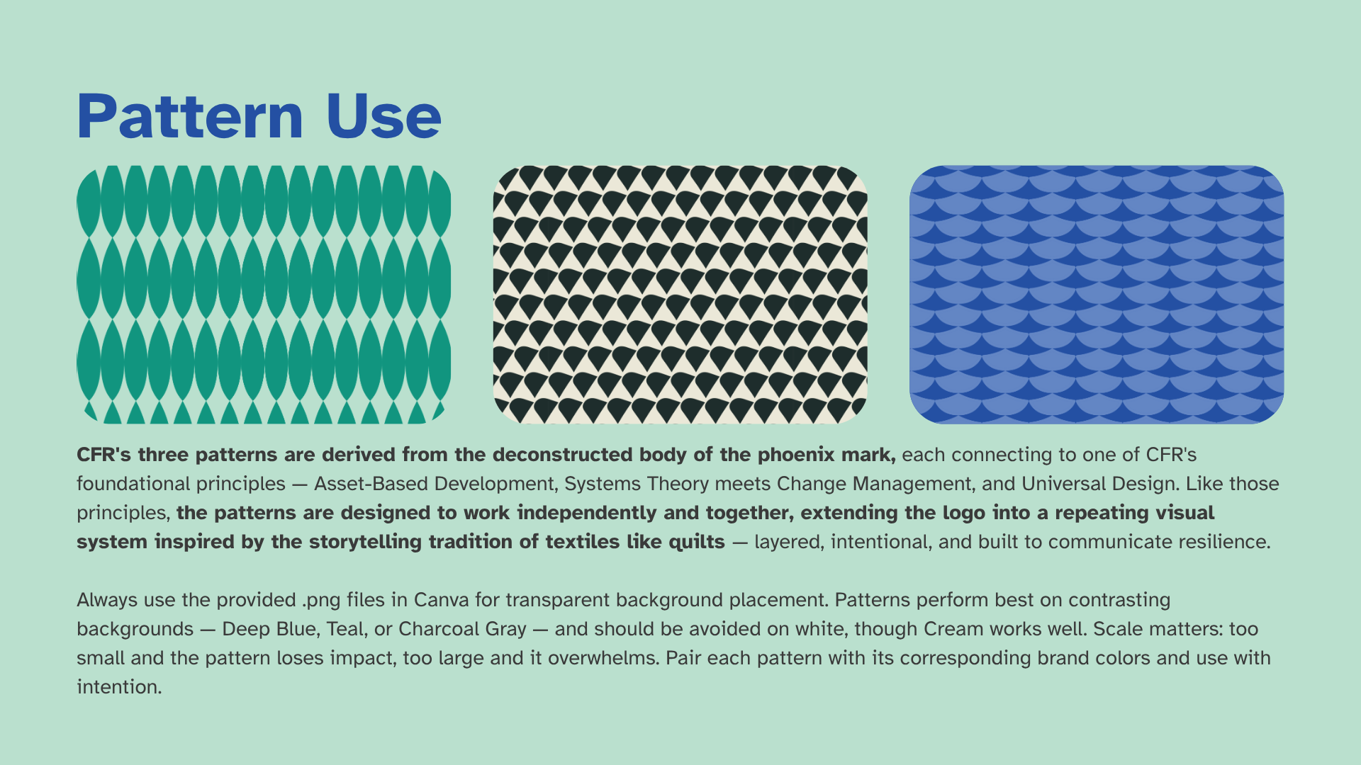
Our designer, Emma Crevier, took that visual imagery further by creating three patterns derived from the deconstructed body of the phoenix mark.
CFR's patterns begin with the phoenix mark — deconstructed, then rebuilt as a repeating visual system. Each piece connects to a principle. Together, they work like a quilt: layered, intentional, made to last.
Typography
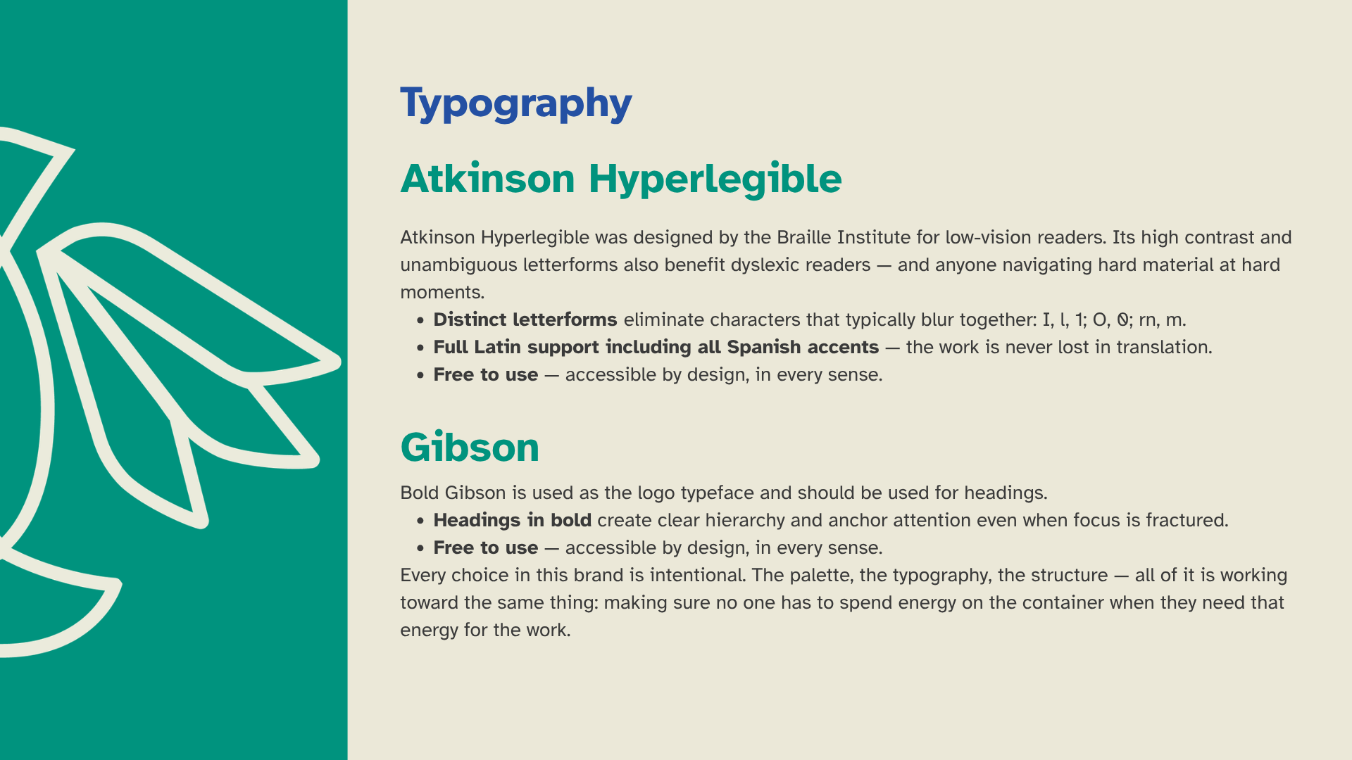
Atkinson Hyperlegible (designed by the Braille Institute) uses high contrast and unambiguous letterforms so the logo and body copy are readable for low-vision and dyslexic users alike. Full Latin support means Spanish accents render correctly, so nothing is lost in translation.
Bold Gibson anchors the headings with clear hierarchy, keeping navigation intuitive even when focus is fractured. Both fonts are free — accessible by design, in every sense. A bilingual English/Spanish toggle and verified color contrast levels carry that same commitment across the whole site.
“Rae and the Más Marketing + Co team were absolutely fabulous in not only helping me build and refine an amazing, accessible brand, but they helped me figure out the laundry list of things I didn’t know and solve them. Instead of making me do the work to figure out the best tools and resources for me to use, they took my end goals and build summaries and lists of recommendations for me to choose from. I was quickly able to trust that they had the best knowledge of what I needed, or that they would work to find it. They were responsive and willing to take feedback and try several iterations until I was completely satisfied. I would absolutely recommend working with them.”