Where Values Meet Visibility: The EquiTable Rebrand

Key Elements of our Approach
Bilingual community engagement
Inclusive brand strategy
Collaborative design process
Client Overview
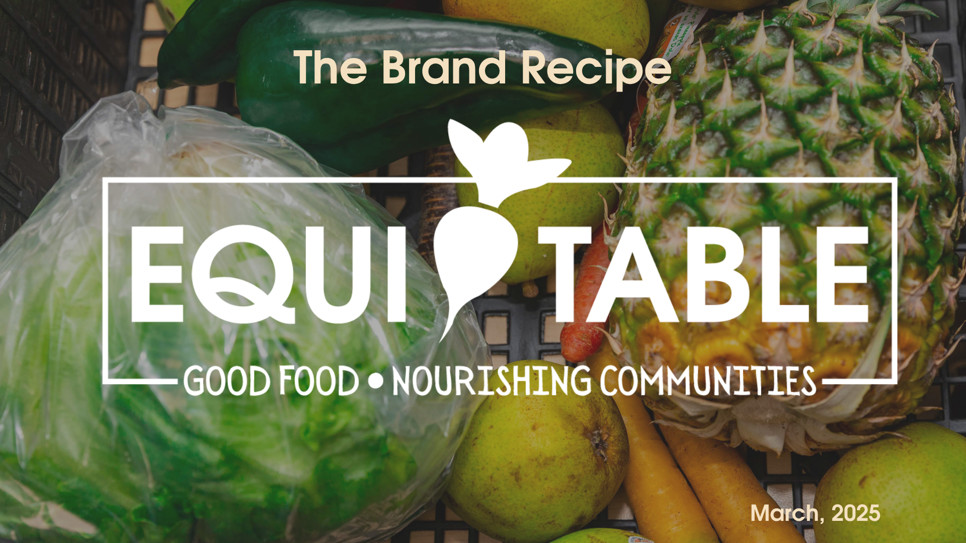
Heartside Gleaning Initiative, a community-based nonprofit, provides fresh, nourishing food to underrepresented communities—particularly the Latine community. As the organization evolved, so did its name and focus. Rebranding as EquiTable, they sought a new identity that honored their roots while communicating a bold vision for food justice, equity, and access.
The rebrand strategy for EquiTable focused on elevating their mission of food equity through a new visual identity, bilingual community engagement, and an inclusive digital presence. Our goal was to align their evolving values with clear, culturally responsive messaging—enhancing visibility, deepening community trust, and increasing engagement across donors, volunteers, and program participants.
Our Approach
At Más we recognize that branding is more than just visuals—it’s about identity, values, and connection. Our approach to EquiTable’s rebrand centered on community input, cultural relevance, and strategic storytelling. With every touchpoint, we aimed to elevate the voices EquiTable serves and support deeper engagement with donors, volunteers, and partners.
Key elements of our approach included:
Bilingual Community Engagement: We facilitated focus groups in both English and Spanish to gather authentic feedback from diverse stakeholders. This ensured the new brand resonated with the people it serves.
Inclusive Brand Strategy: We conducted a communications audit to assess current gaps and strengths, then built a brand strategy grounded in EquiTable’s mission, values, and commitment to food equity.
Collaborative Design Process: From naming to visuals, we worked closely with the EquiTable team to co-create a brand that feels rooted, modern, and accessible.
Final Deliverables
Comprehensive Communications Audit
Evaluation of existing materials, website, and social media to guide strategic improvements.
Brand Kit & Messaging Guide
Building on the client-selected name EquiTable, we created a full visual identity system—including logo design, color palette, and typography—that reflects the organization’s commitment to equity, nourishment, and community. The final design balances warmth and professionalism to resonate across diverse audiences.
Custom Website Design
Fully responsive, accessible, and bilingual website with intuitive navigation for volunteers, community members, and donors. QR code integrations direct users to events, donation forms, and community resources.
Branded Photography
We partnered with Isabel Media Studios to provide authentic imagery showcasing EquiTable’s programs, community, and impact—used across print, web, and social media.
2024 Annual Report Design
We designed EquiTable’s first annual report under their new brand identity—visually compelling, easy to navigate, and aligned with the refreshed aesthetic and messaging to reflect impact, transparency, and organizational growth.
Outcome
EquiTable now has a cohesive, compelling identity that matches the strength of its work. Their new brand and website uplift their values, improve user engagement, and position them for sustainable growth and deeper community impact.